
Designing a responsive website is no longer optional; it’s a necessity. With more than half of web traffic coming from mobile devices, Google now prioritizes mobile-friendly websites in search rankings. The good news? You don’t need to know coding to achieve this.
In this beginner-friendly guide, you’ll learn the easiest way to design a responsive website on WordPress using Elementor. Elementor is one of the most popular drag-and-drop page builders that allows you to create professional websites that look perfect on desktop, tablet, and mobile devices.
Whether you’re a blogger, business owner, or freelancer, this guide will help you build a modern, responsive WordPress website step by step.
Mobile Responsive View
Watch the Video Tutorial
Prefer learning visually?
I’ve created a step-by-step video tutorial that shows the easiest way to design a Responsive Website on WordPress using Elementor
Video coming soon
What Is a Responsive Website?
A responsive website automatically adjusts its layout, images, and content to fit different screen sizes.
Why Responsive Design Matters
- Improves mobile user experience
- Boosts SEO rankings (Google mobile-first indexing)
- Reduces bounce rate
- Increases conversions
Why Use Elementor for Responsive Design?
Elementor makes responsive web design easy, even for beginners.
Benefits of Elementor
- Drag-and-drop visual editor
- No coding required
- Built-in responsive controls
- Live preview for mobile and tablet
- Works with most WordPress themes
Tools You Need Before You Start
Make sure you have the following ready:
- WordPress installed
- Elementor plugin (Free or Pro)
- A lightweight theme (Kadence, Astra, or Hello Elementor)
- Website content (text & images)
How to Install Elementor on WordPress (Beginner’s Step-by-Step Guide)
Step 1: Create a Page with Elementor
- Go to Pages → Add New
- Enter a page title
- Click Edit with Elementor
- Choose a blank canvas or template
- This opens Elementor’s visual editor, where you can start designing.
Creating a new page with Elementor in WordPress
Step 2: Build Your Website Layout
Start with the basic structure:
Essential Sections
- Header / Hero section
- About section
- Services or Features
- Call-to-Action (CTA)
- Footer
Use Elementor widgets like:
- Heading
- Text Editor
- Image
- Button
- Columns
How to Design a Website About Us Page on WordPress Using Elementor (Beginner Guide)
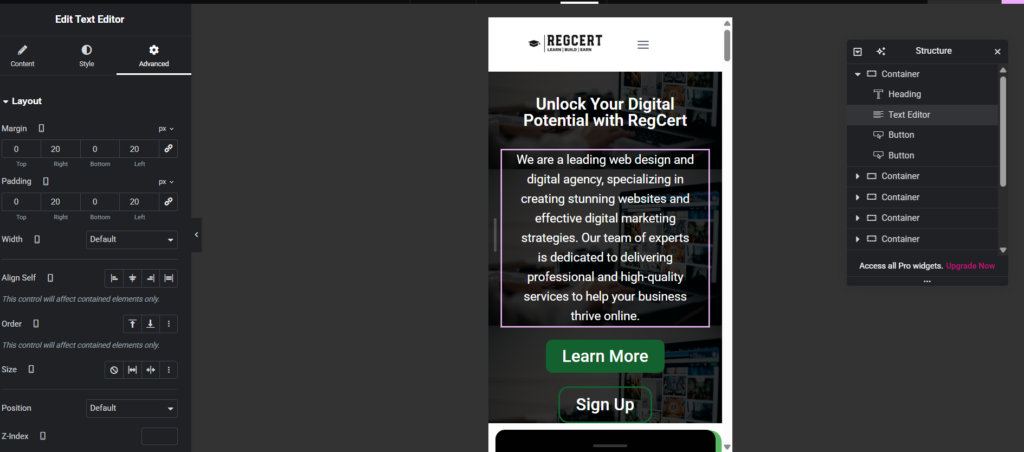
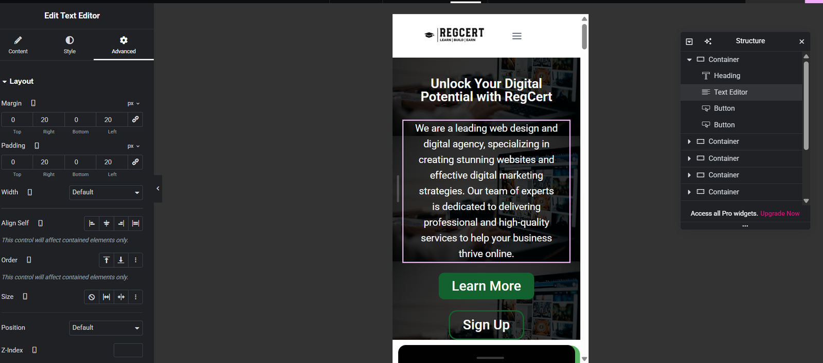
Step 3: Enable Responsive Editing in Elementor
Elementor allows you to customize designs for each device.
How to Switch Views
- Desktop icon
- Tablet icon
- Mobile icon
You can adjust:
- Font size
- Padding & margins
- Column width
- Alignment
Need a responsive website?
Then you are in the right web agency, Regain Tech Concepts
Step 4: Optimize Text for Mobile Devices
Large text may look good on desktop but break layouts on mobile.
Best Practices
- Use smaller font sizes on mobile
- Limit long paragraphs
- Increase line spacing
- Center-align important text
Elementor allows different font sizes for each device easily.
Step 5: Make Images Responsive
Images are a major cause of slow and broken layouts.
Image Optimization Tips
- Use compressed images
- Avoid fixed widths
- Hide large images on mobile if needed
- Use Elementor’s responsive visibility settings.

Step 6: Adjust Columns for Mobile
Desktop layouts often use multiple columns that don’t fit on mobile.
Solution
- Stack columns vertically on mobile
- Adjust column width to 100%
- Hide unnecessary columns
This ensures smooth scrolling and better readability.
Step 7: Test Your Website Responsiveness
Before publishing, always test.
Testing Methods
- Elementor mobile preview
- Browser resize test
- Google Mobile-Friendly Test
- Test on real devices
Common Mistakes to Avoid
- Ignoring mobile layout
- Using too many animations
- Oversized images
- Poor font readability
- No mobile CTA
Avoiding these mistakes will improve both SEO and user experience.
SEO Tips for Responsive WordPress Websites
- Use mobile-friendly themes
- Optimize images for speed
- Enable caching
- Use proper heading structure
- Focus on Core Web Vitals
Responsive design directly impacts Google rankings.
Frequently Asked Questions (FAQ)
Designing a responsive website on WordPress doesn’t have to be complicated. With Elementor, you can easily create a professional, mobile-friendly website without writing a single line of code.
By following the steps in this guide, you’ll ensure your website looks great on all devices, loads faster, and ranks better on Google.
Table of Contents
Quick Links
- How to Turn a Smartphone Into a Full-Time Income Machine: Step-by-Step Guide.
- Essential WordPress Security Tips to Protect Your Website Effectively
- How to build your first website using Elementskit for free
- WordPress Posts vs Pages: What’s the Difference and When to Use Each
- How to Write Your First WordPress Blog Post (Step-by-Step Beginner Guide)


[…] Easiest Way to Design a Responsive Website on WordPress Using Elementor […]
[…] How to Design a Responsive Website on WordPress Using Elementor […]
[…] How to Design a Responsive Website on WordPress Using Elementor […]